Free
Make “Free” easy to find.
We enlarged the word, gave it the handwritten face and added small terracotta sparkles. The exchange’s central message stands out in the introduction.

Children outgrow things. Another family can use them.
Kiddos Closet is a children’s clothing and essentials exchange in Santa Barbara. Its website puts a simple invitation first: take what you need, share what you can.
We began with a supplied partner design, refining its typography and bringing its illustration to life. We developed the About page from Lauren’s account of how Kiddos Closet began, built the Mission-page layout, and connected the site with shared navigation and responsive layouts.
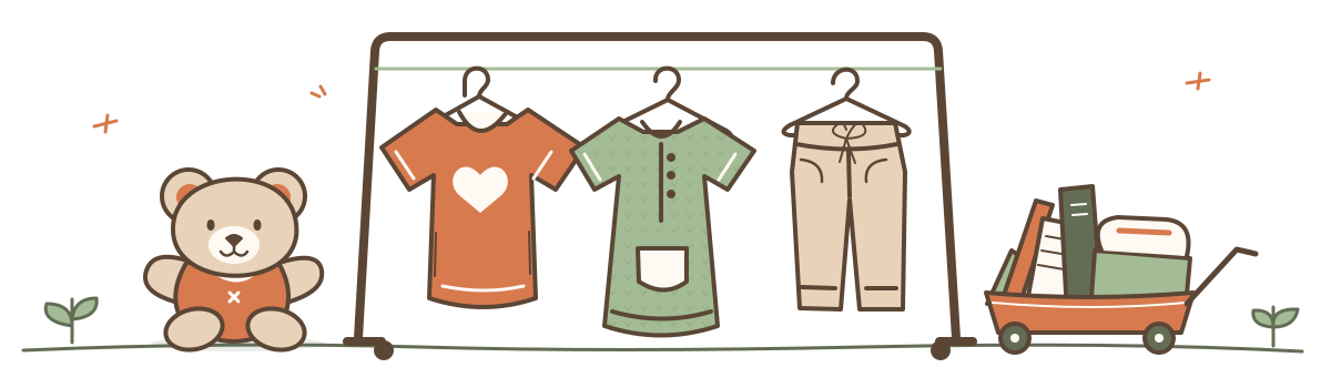
The supplied identity pairs a hand-drawn mark with a bear, a clothesline and a small cart. Warm paper tones and terracotta keep that same character around the practical information.
Good things
to grow with.
Coming Soon
A handwritten voice for headings.
Nunito
Rounded, readable supporting text.
We carried the supplied identity into the website, refining type, spacing and motion while preserving its warm, illustrated character.
The page moves from the invitation to two ways to participate, then visiting information and the items the community can share. Each section answers a practical question.
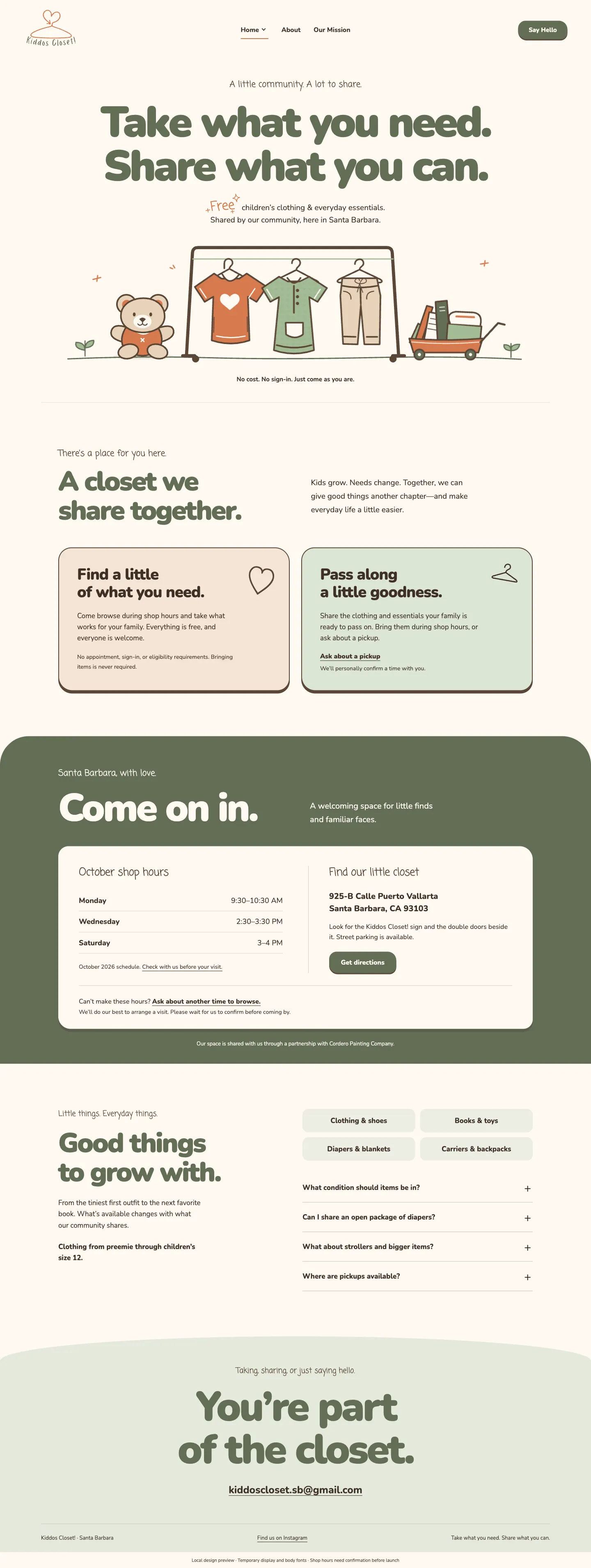
Two side-by-side invitations explain how to find something for your family or pass something along.
The visiting section brings the location, directions and a way to ask about another time together.
Item categories and expandable answers explain what can be shared and when to contact the team first.
Homepage captures · October 19, 2026.
Lauren’s experience gave the About page its starting point. We shaped her account into a narrative that connects the help she once received with the welcome Kiddos Closet offers families today.
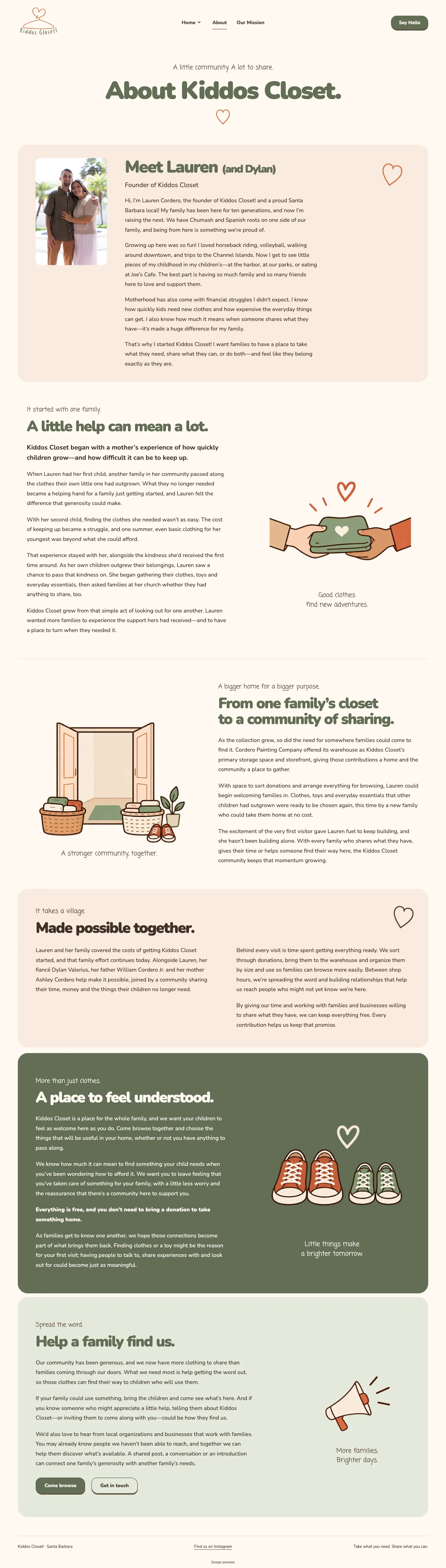
About-page capture · October 19, 2026.
The narrative moves from one family’s experience to a community sharing what children have outgrown. It makes clear that everything is free and no donation is required.
We paired the story with illustrated moments of sharing and belonging. On smaller screens, the text and artwork stack in reading order.
We built shared navigation and consistent header spacing across the Home, About and Mission pages.
We made the existing illustration respond to the visitor. The bear hops, each garment sways on its own and the cart rolls a little way before coming back.
One piece at a time. Each garment finishes its sway after you move away.
We enlarged the word, gave it the handwritten face and added small terracotta sparkles. The exchange’s central message stands out in the introduction.
Come on in.
Preloading the fonts and controlling their fallback reduces the distracting change from default lettering to the handwritten face.
Nothing needs to loop to invite a response. Keyboard focus remains visible, and reduced-motion preferences keep the scene still.
We delivered an interactive homepage, an About page shaped around Lauren’s story, and a Mission-page layout. Typography, responsive layouts and shared navigation brought the pages together, while small interactions gave the supplied illustration a welcoming sense of life.
The work built on the supplied partner design and artwork. EMBR developed the page layouts, shaped the About-page narrative, and implemented the responsive navigation and interactive details.
Let’s talk about what it needs to say, how it works and the people it should reach.